When I first joined CaptainU, I was asked to look at the mobile app they were developing for coaches to be used for evaluating prospective athletes at events. The app I found was confusing and looked like unstyled wireframes.
I was able to quickly redesign the app and provide a few UX enhancements that made demos and onboarding a lot easier.
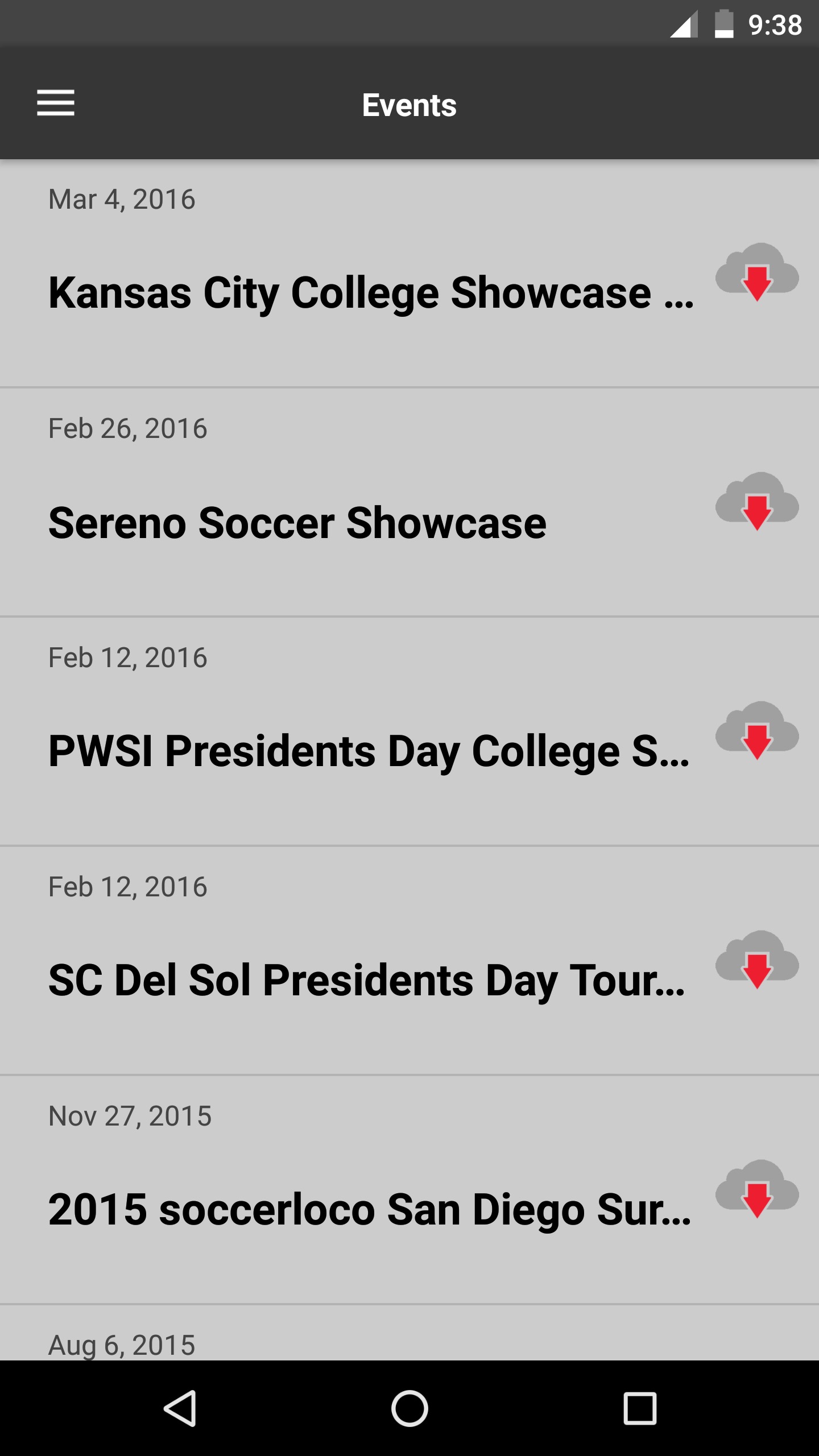
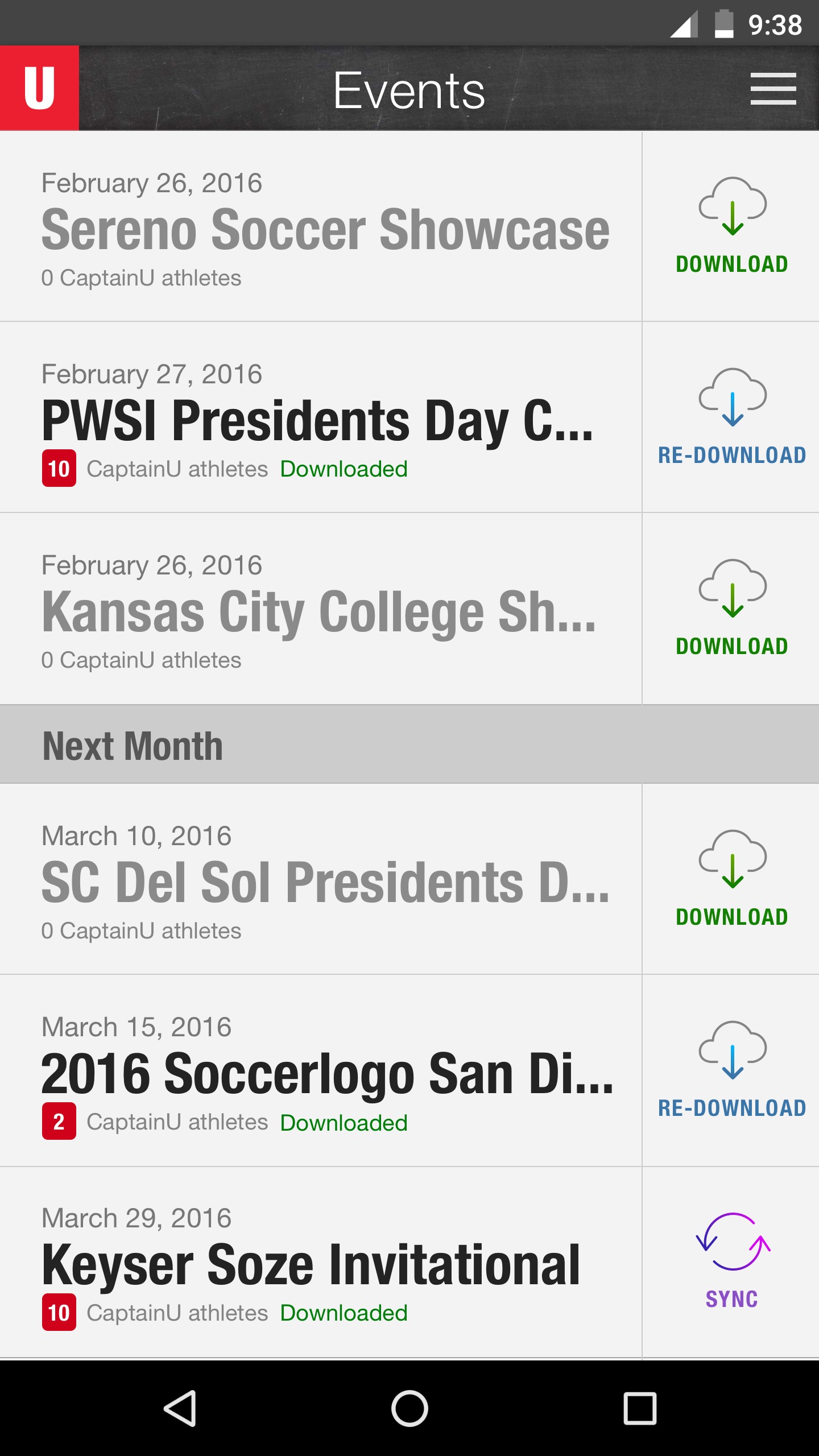
This the first screen you see in the app. It lists all the events you are scheduled to go to, when they are and if you need to download or sync the details. In the initial version, it was difficult to tell if you had downloaded anything, events weren't grouped by month and the whole UI was fifty dark shades of grey.
To make the app easier to use, I designed a new button style for the download/re-download/sync variations, chunked events by month and updated the UI with a lighter background, white-space and font enhancements for readability, and chalkboard background header reminicient of going over the Xs and Os.
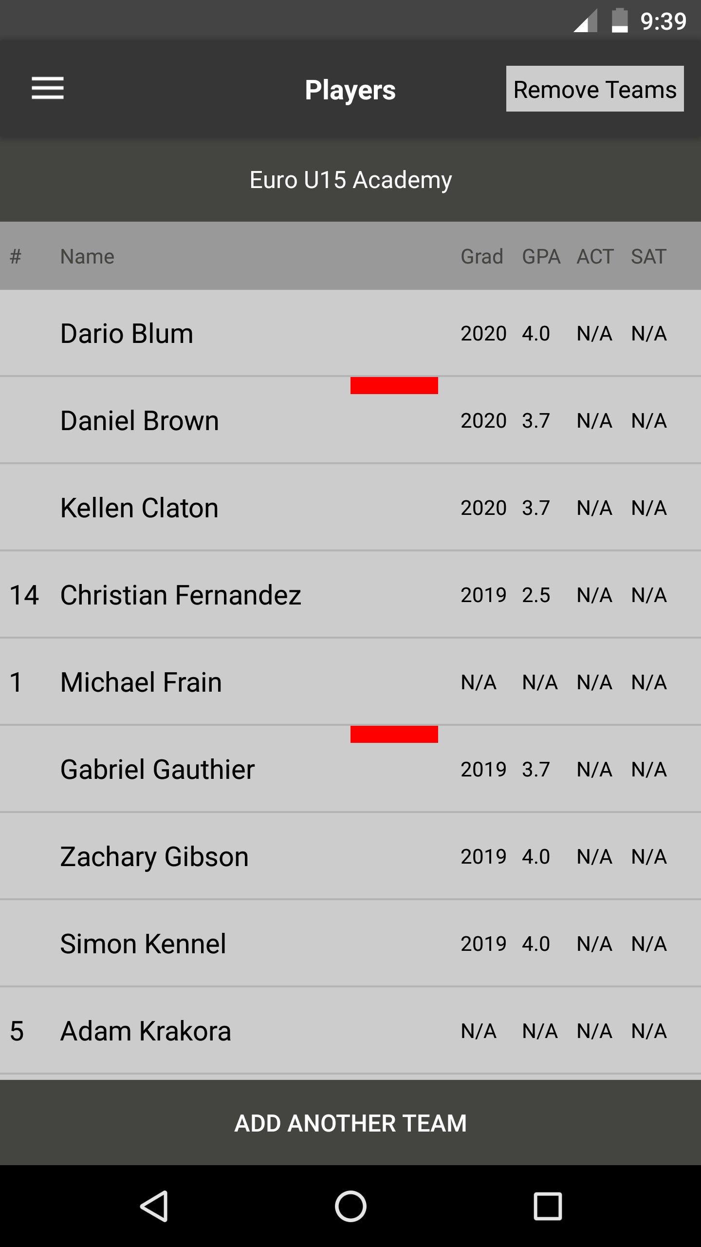
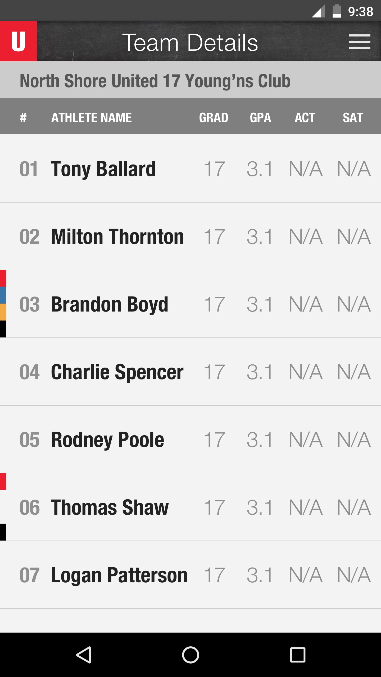
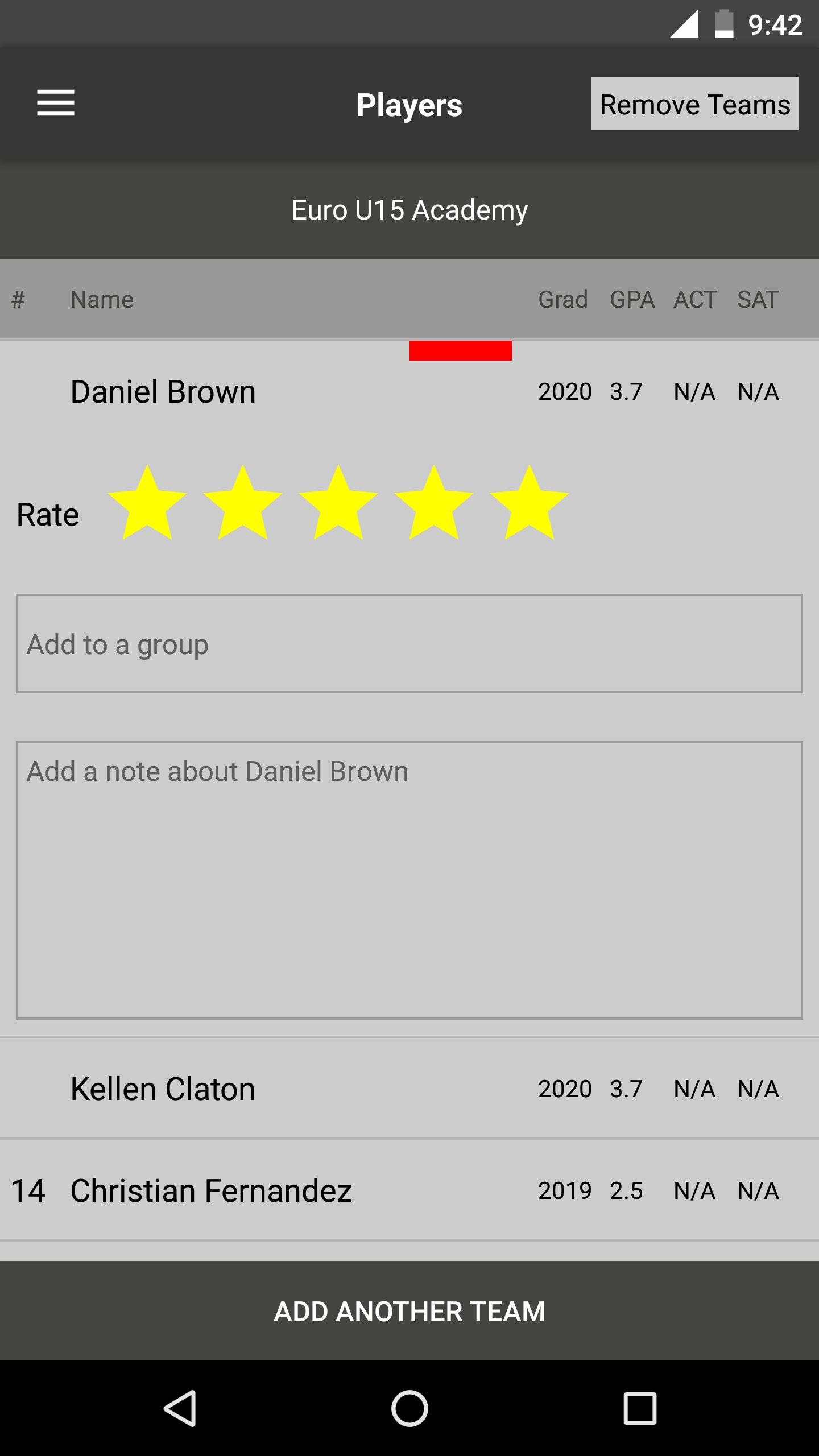
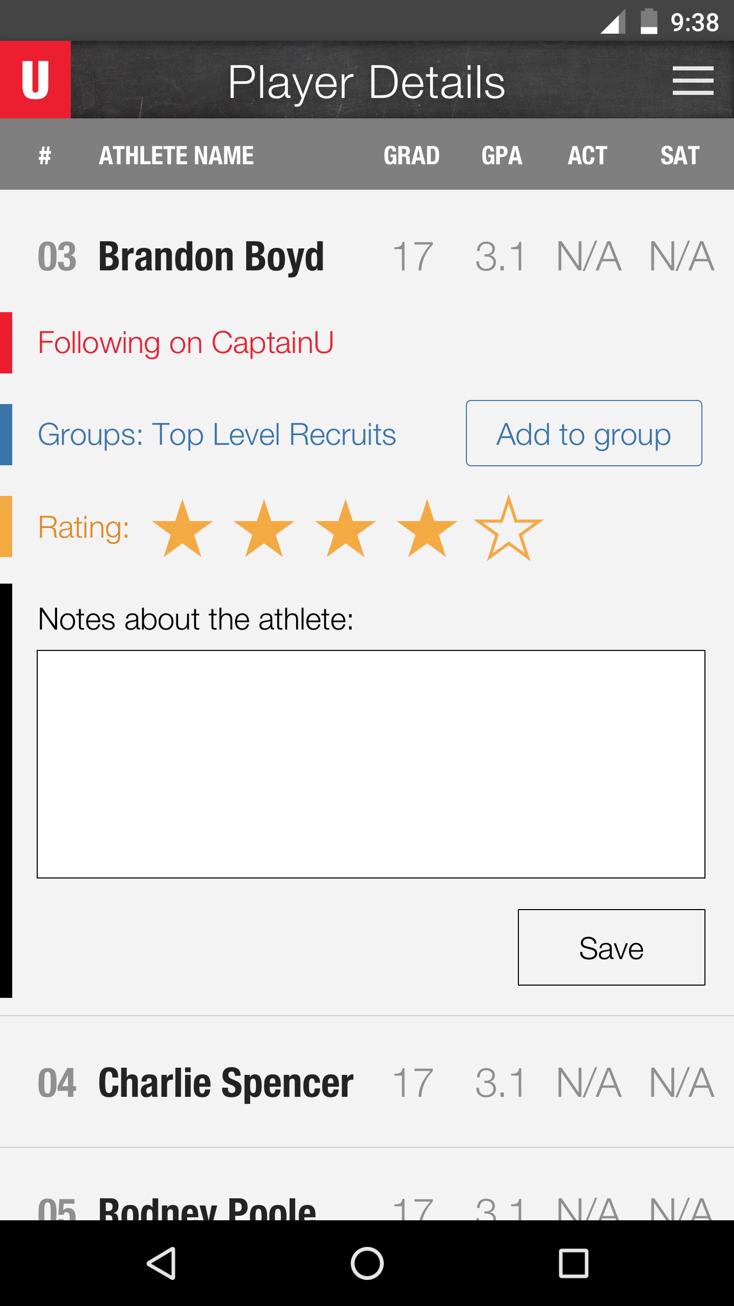
When it came to showing coaches a team roster, this view had to be easier to scan and needed to introduce the 4 different elements coaches could annotate for each athlete.
Initially, the app had some color bars that would appear in an athlete's row but when you tapped on that athlete, you had no idea what those colors meant. I took the basic colors, placed them on the far left so they would expand and reveal what they meant when you tapped on an athlete.
With an athlete detail view open, you can follow them on College web app, quickly give them a star rating, create and add them to a group, and write a detailed note. You can then scroll up or down to look at other recruits and take notes on them. This was designed for quick note taking as the primary workflow.
Here is the workflow of tapping on an event, a team, and then an athlete and noting their performance.
Here's how our search functionality behaves.
Here are a few sketches from my process. I thought it was important to find a way to show the 4 different types of data you could enter for a recruit and so I came up the 4 color bars that I've described above.