College coaches can search for and start recruiting high school athletes using a variety of powerful tools in our college app. App usage, however, was lower than what we wanted and onboarding required direct training from account managers.
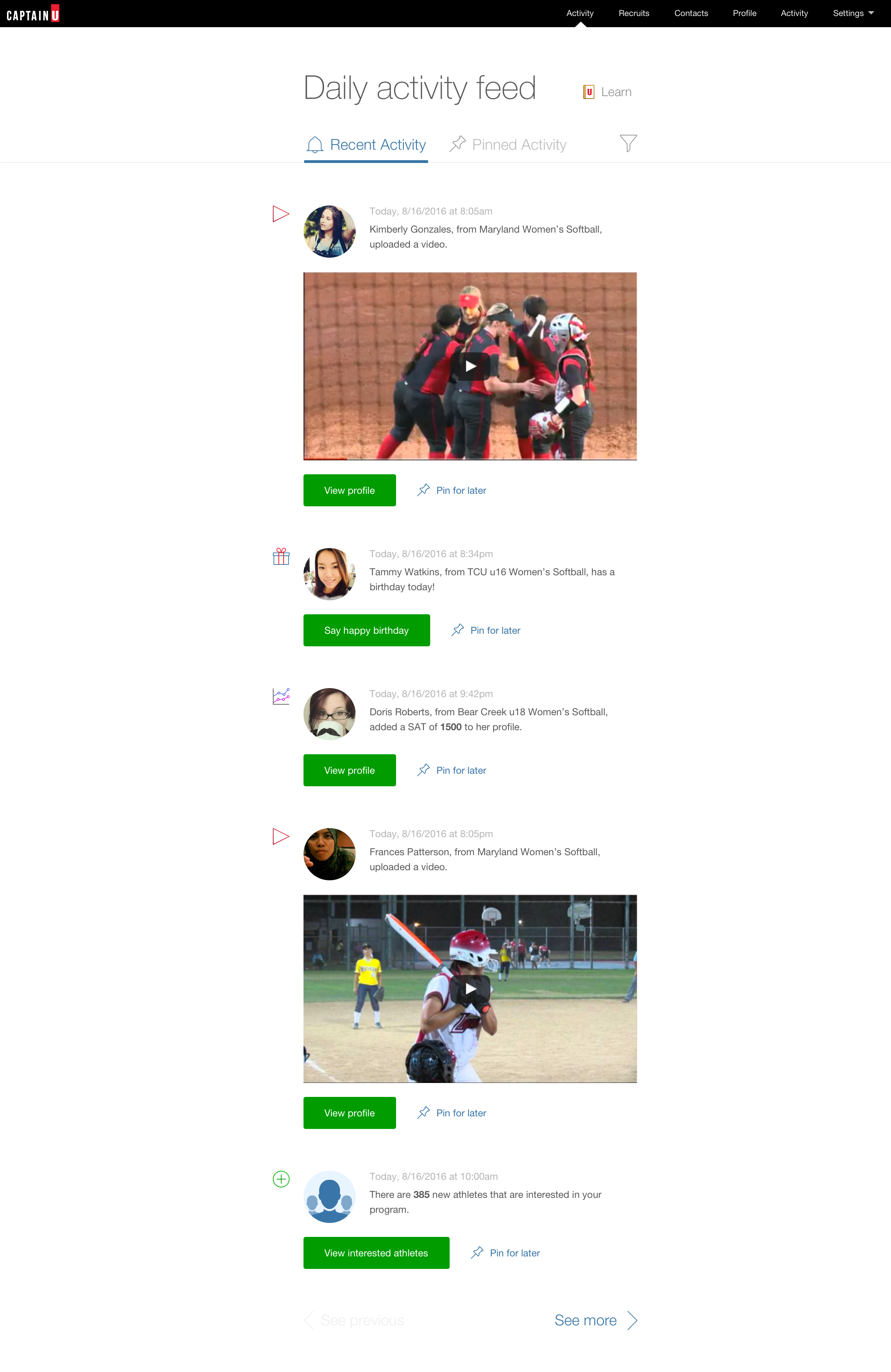
To change this, we created a facebook-like activity feed around their prospective recruites’ daily profile and event updates and built an onboarding system called the learning center.
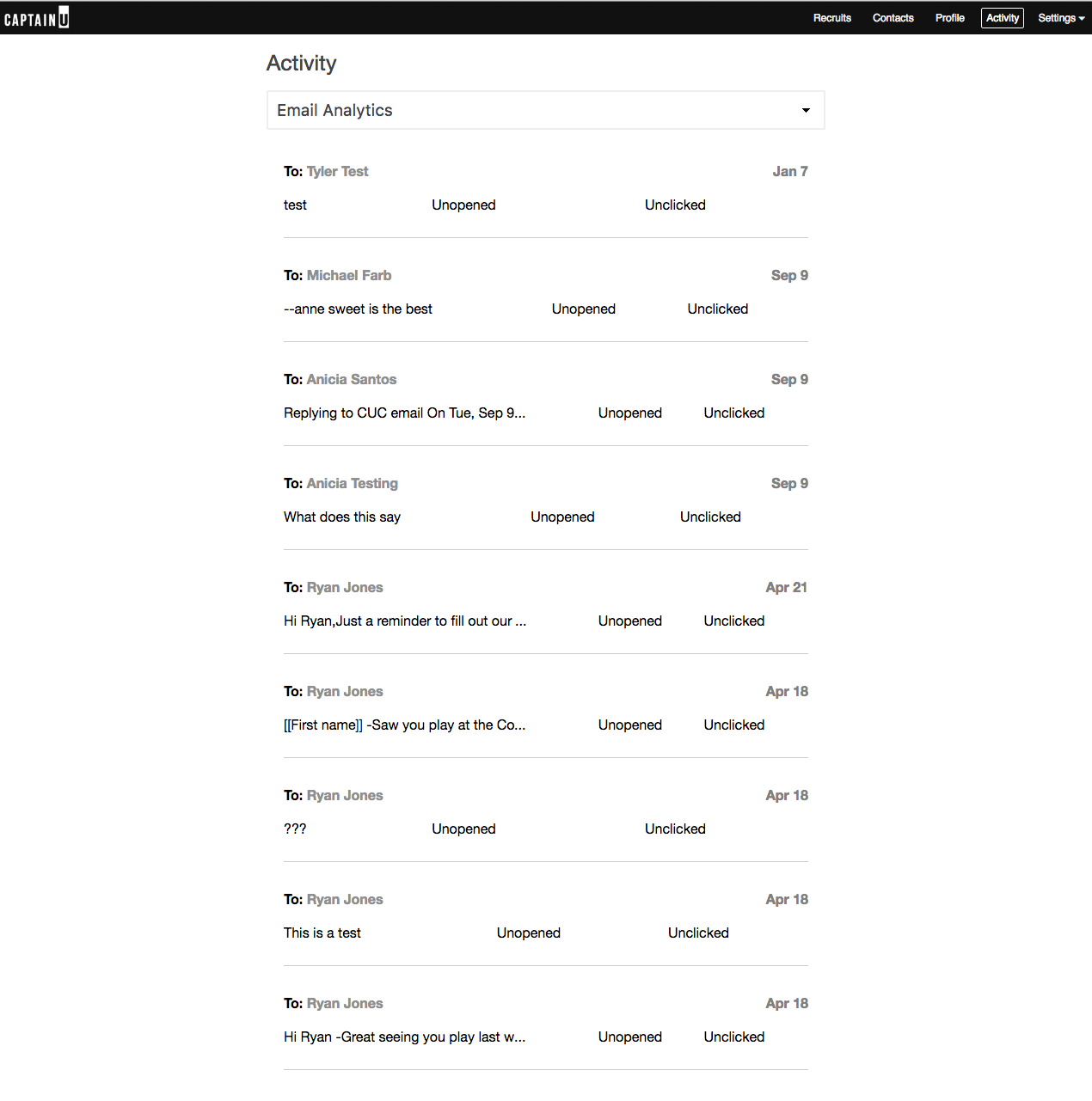
Here's a before and after shot. The original version was pretty much a wall of text with nothing to act on. As you'll see in there wireframes, we tried a few layout and content options but ended up going with a UI that draws inspiration from Twitter and Facebook. This paid off in user testing since folks were very familiar with this kind of UI.


This is the onboarding experience that coaches see when they first sign-up. The learning center gives them the top 3 things they need to know and leads them to a tour of the activity feed.
When they take the tour, they are walked through a few examples of the content they will be able to work with.
During UX testing, coaches really liked the ability to wish a recruit a happy birthday because it gave the athlete a sense that this coach saw them as more than just a number on a roster.
Filtering allows them to quickly drill down to an activity type.
Pinned activity is a way to bookmark items to act on later.


