The goal was to make the most technical & support-heavy part of our product easy to use.
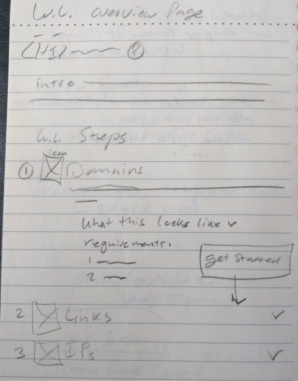
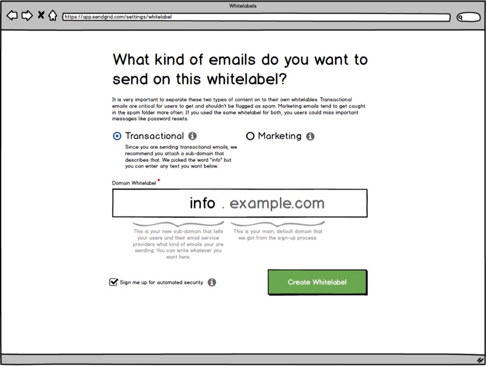
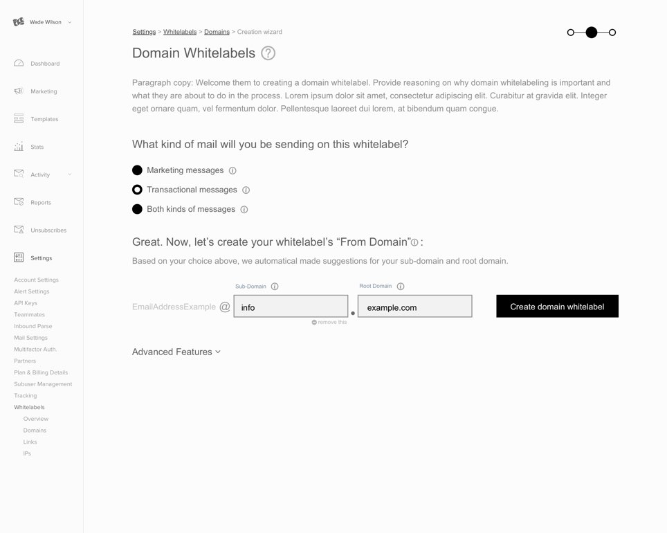
I sketched, user tested, and designed several iterations to craft a user experience that onboarded new users and helped them set up reputation-strengthening whitelabels through a wizard workflow.
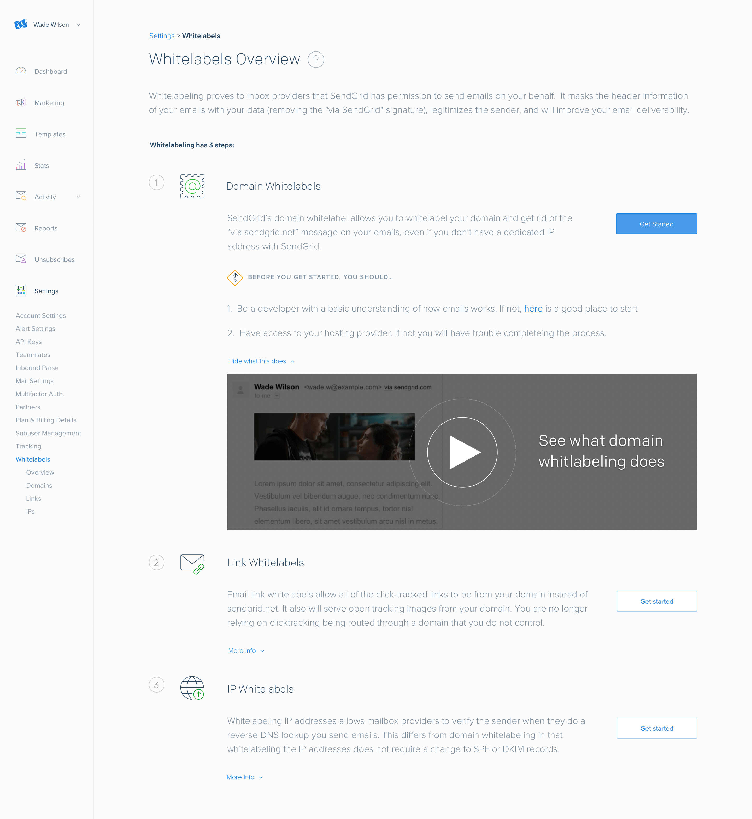
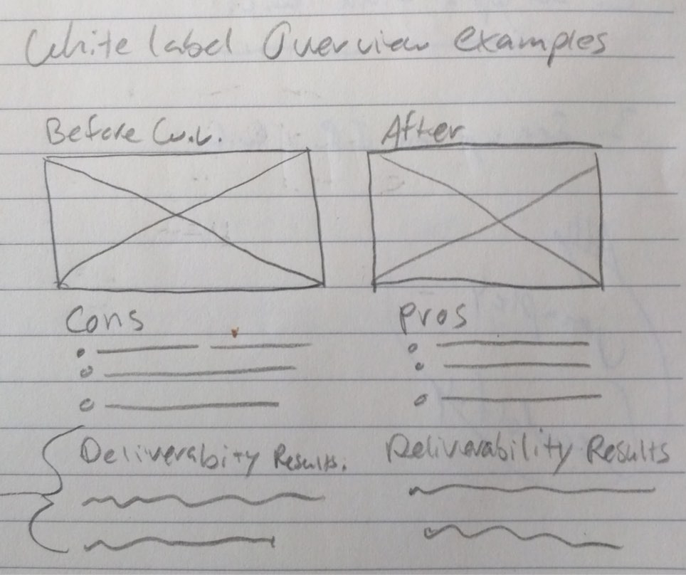
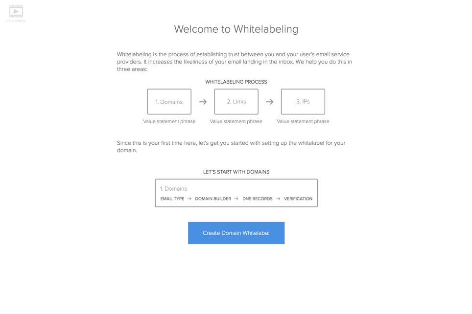
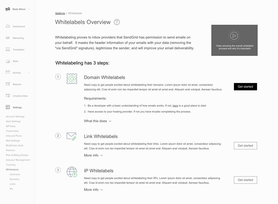
Before people get into the process of building a whitelable, it was important to set the stage. I used clear information architecture to layout the overview page and encourage them to start the process or they could watch an animation that quickly showed the end result.
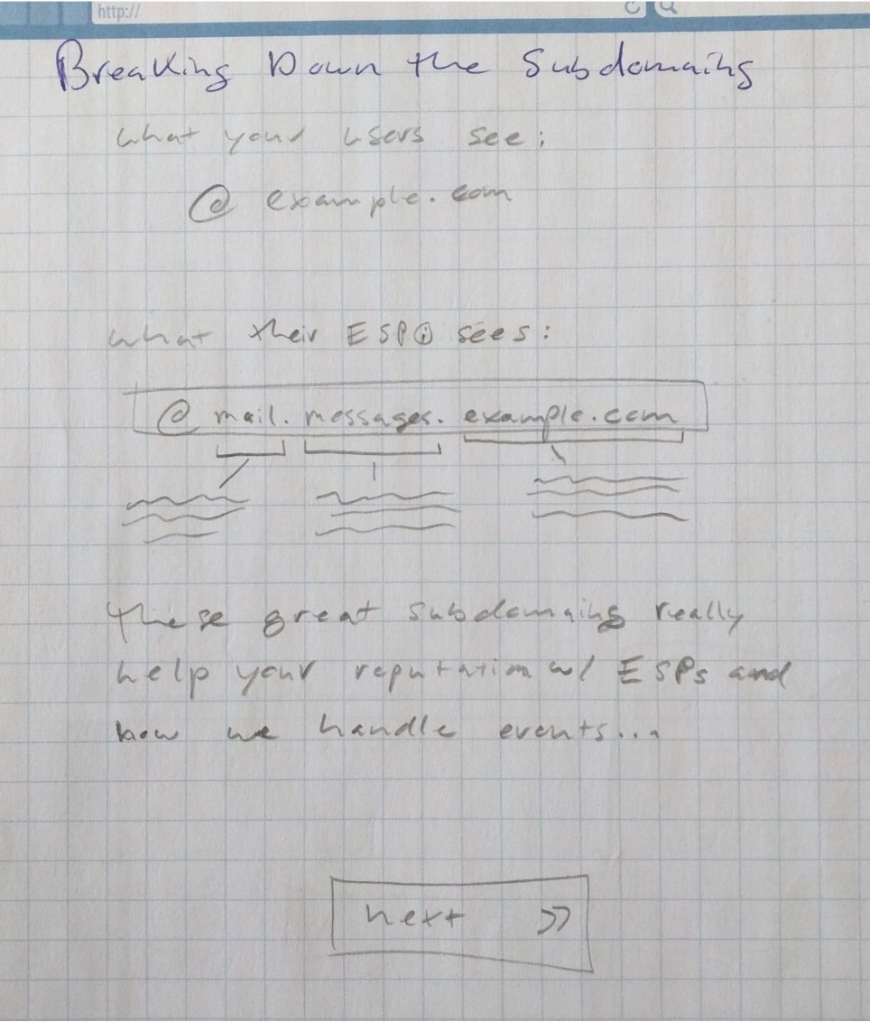
When developers start integrating SendGrid into their operations, they get a crash course in email policies and best practices. In order to make their first experience with whitelabeling less confusing, I made an animation of what domain whitelabling does using Sketch and Principle.
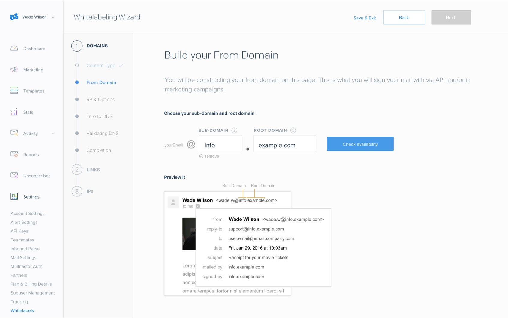
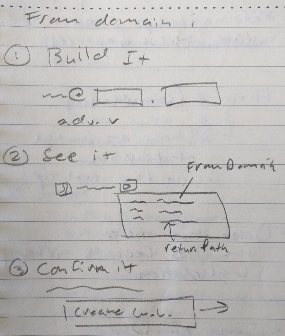
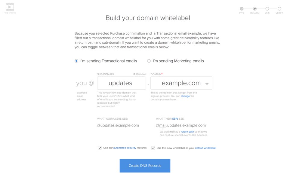
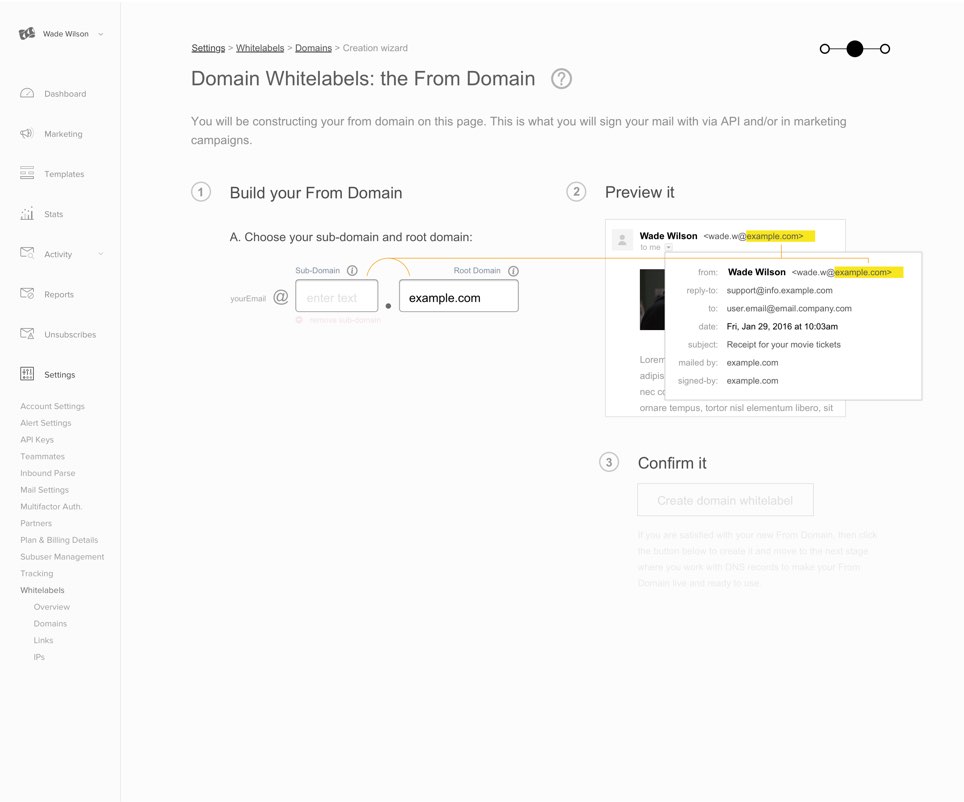
The domain building form below is the center piece of the wizard experience. It shows them a preview of what they were making in order to crystallize what the end result will be.
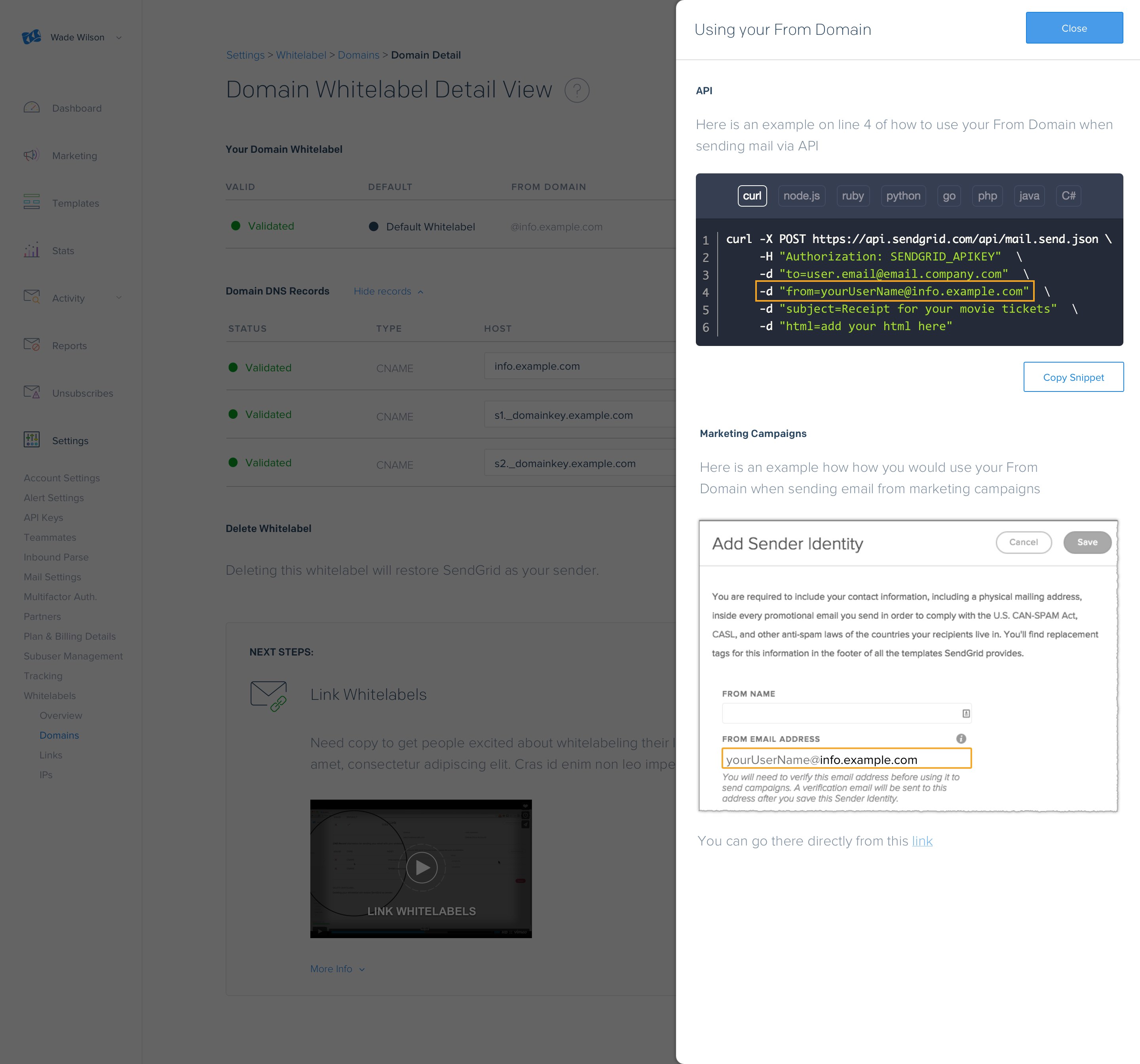
After they completed the wizard, I thought it was important to show them how they could start using their new whitelabel. I designed visual instructions for the most common use cases.
